Get to know your rainbow and why it's important
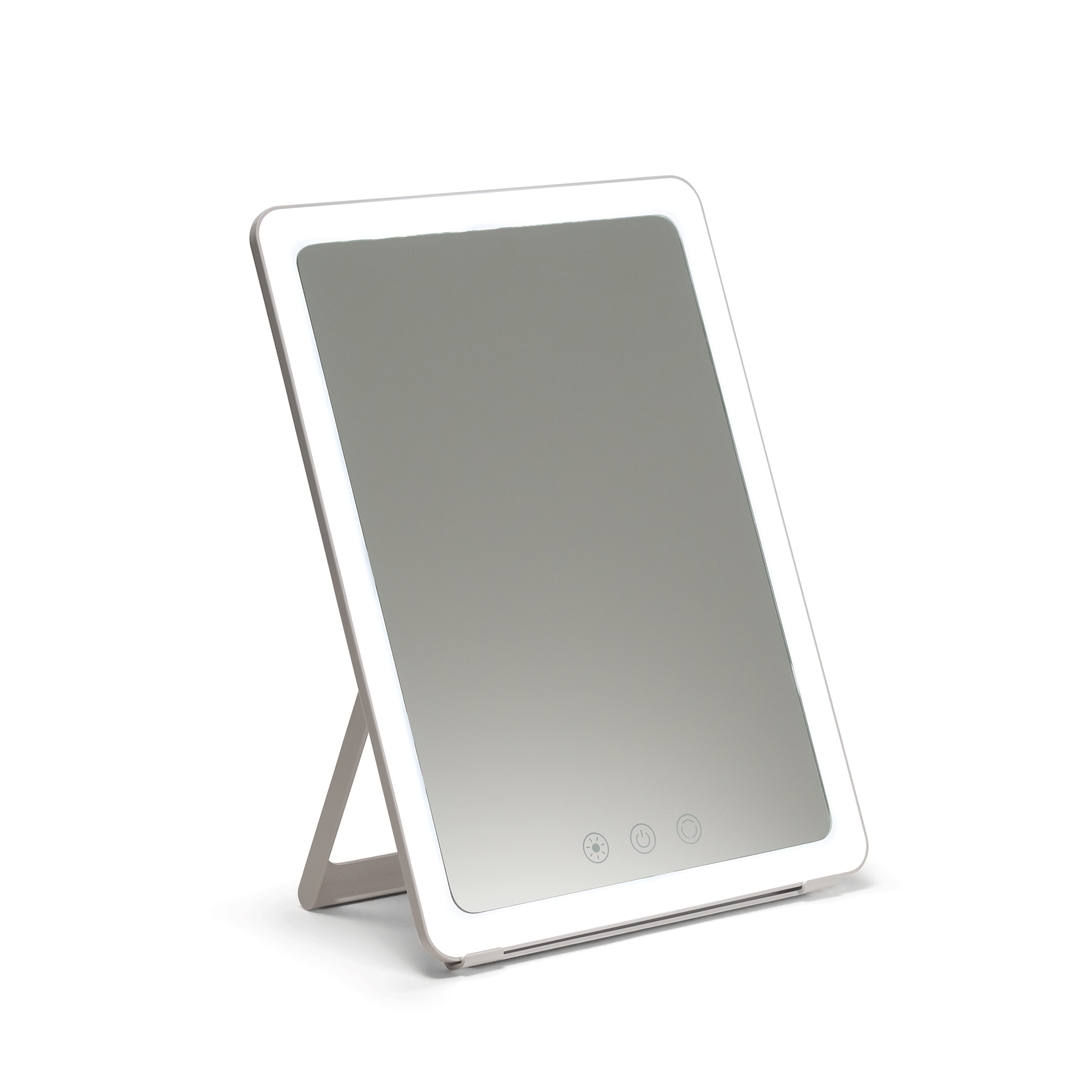
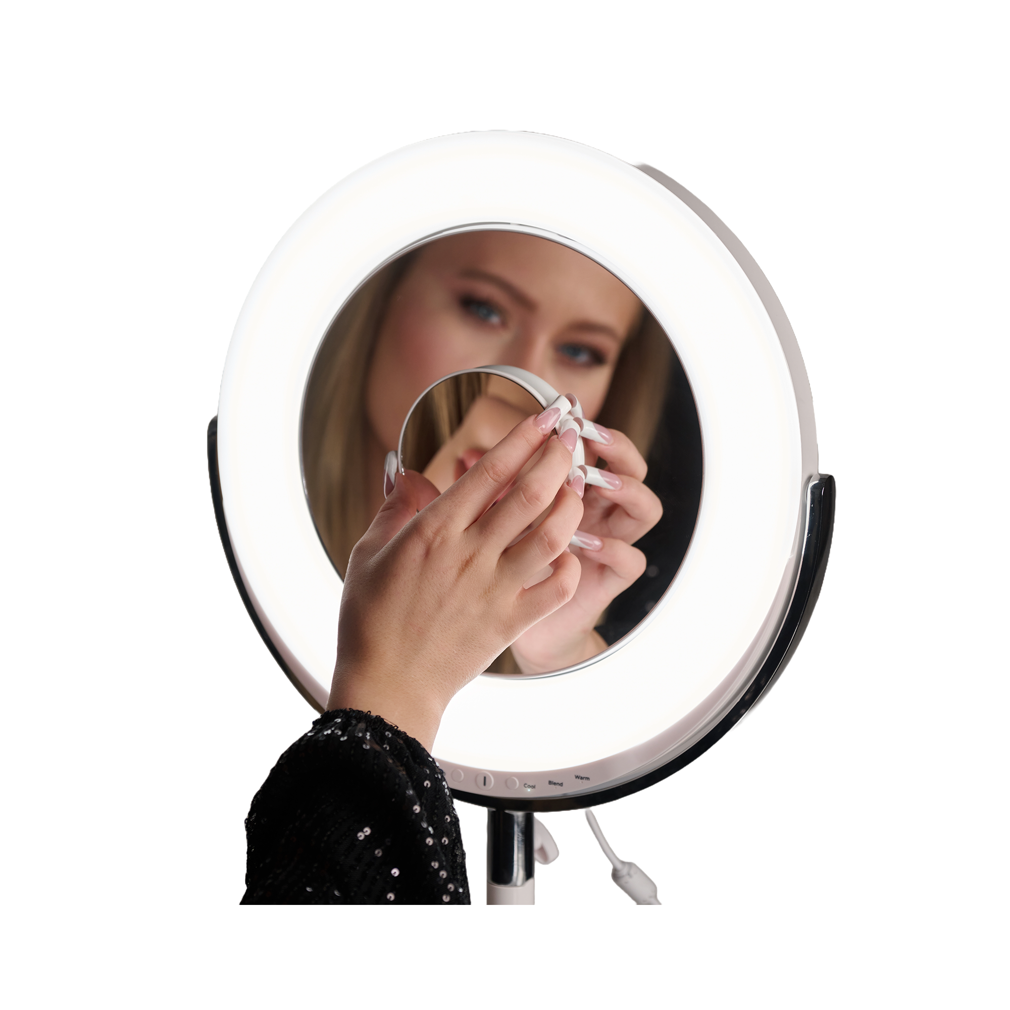
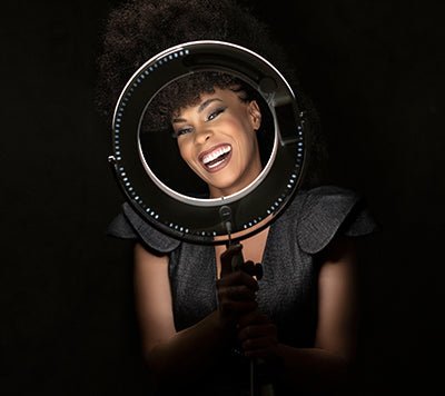
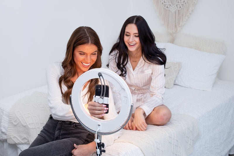
Have you ever really thought about your color? Sure, you may really like neutrals, but how about which shade of green brings out your eyes? Ilios Lighting’s Beauty Ring is going to change your wardrobe. Get ready to have some fun!
CRI to the rescue
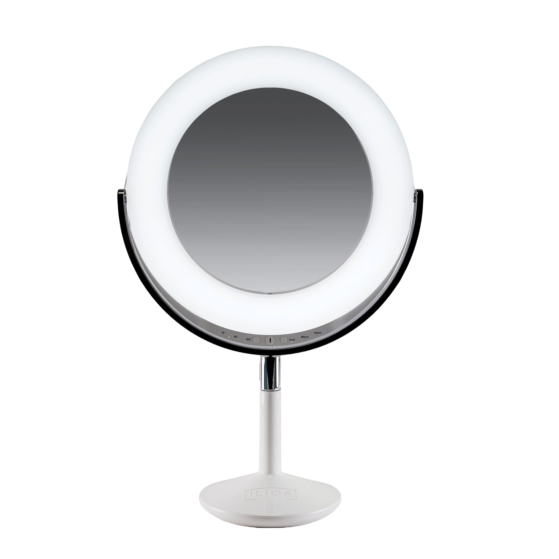
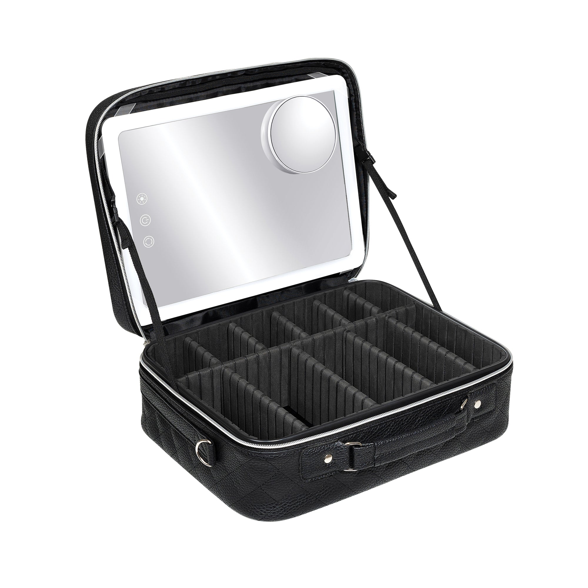
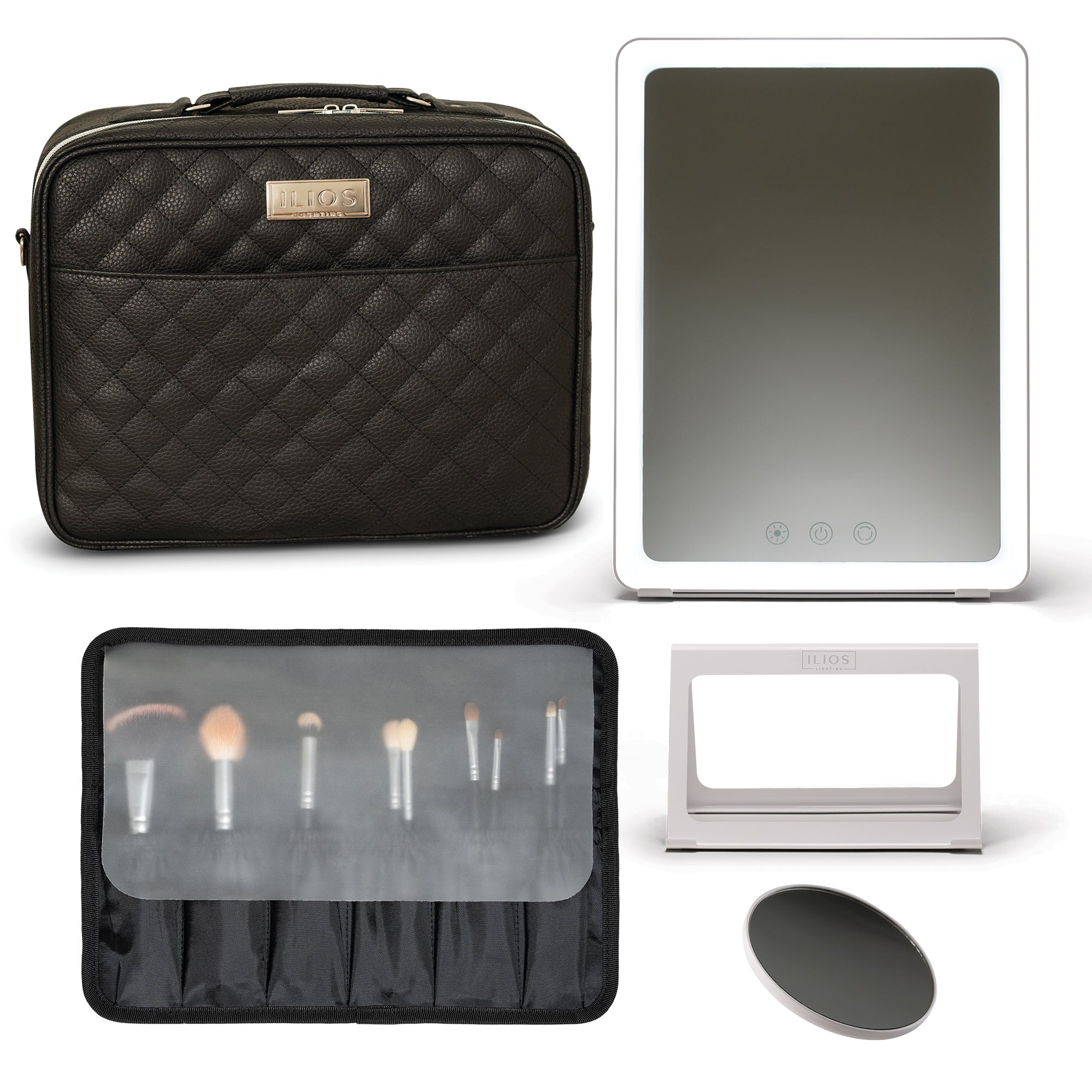
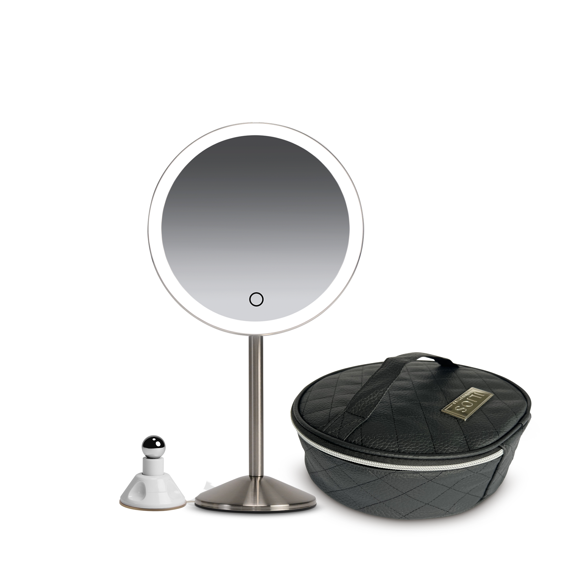
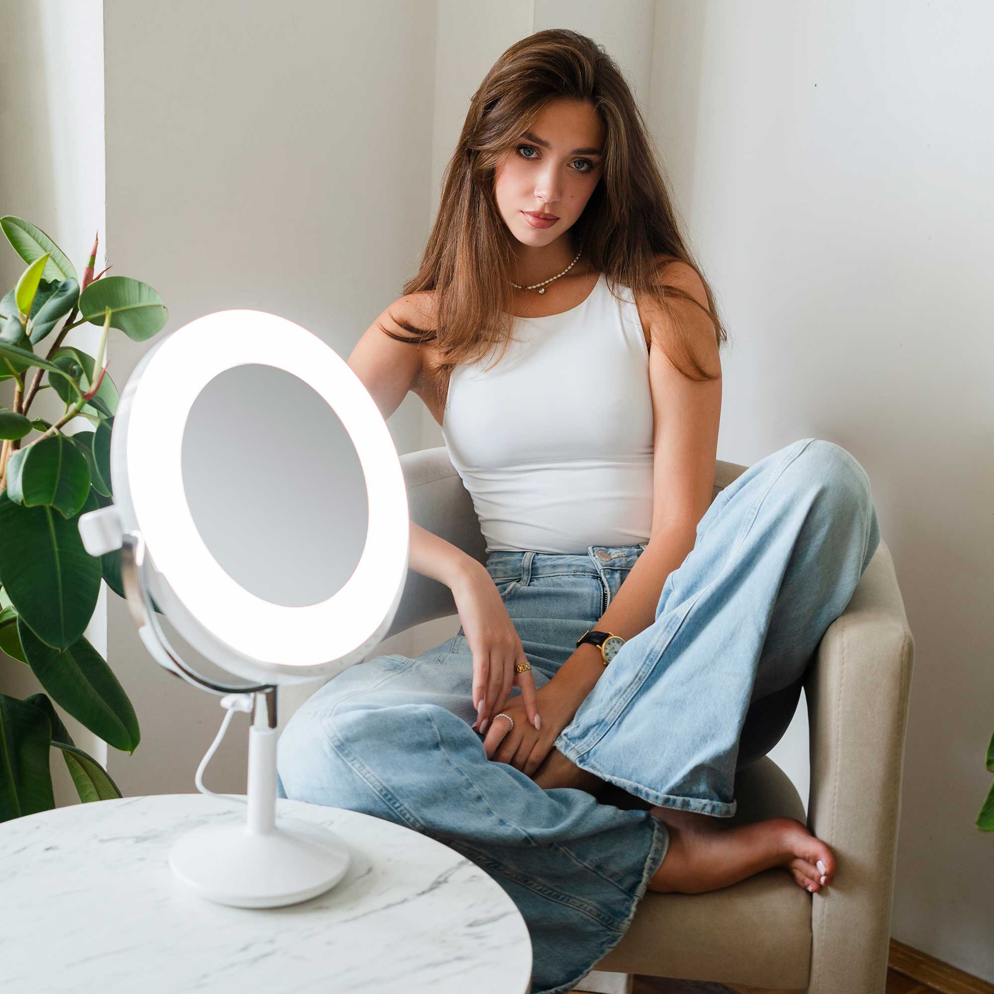
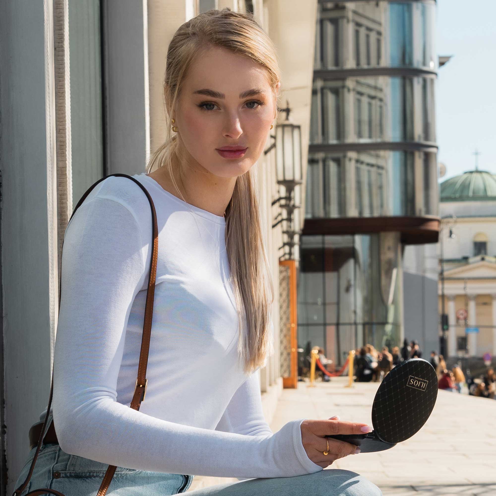
Ilios Lighting’s Beauty Ring is the closest to the color accuracy of the sun as you can really get. With a 98 CRI (Color Rendering Index) rating, sitting down in front of the ring light is going to light up your world in a way that gives you the truest representation of your coloring.
Your beautiful freckles, your melanated skin, your hazel eyes, your port-wine stain. All are represented in almost their truest form when the Beauty Ring lights up your face.
Yes, you’ll also be able to absolutely slay your smokey eye, but let’s get creative. Have you ever thought about the colors that make up your existence?
Your complexion, your hair, your eyes, and your birthmarks and freckles are your built-in rainbow. They’re how you start your day and what you work with when you create your look at large.
Time to learn how to take these factors and play them up to the ultimate level using your Ilios Lighting’s Beauty Ring.
Color Theory 101
You may not have thought about the color wheel since high school art class, but it’s time to reacquaint yourself.
There are three primary colors, three secondary colors, and then you blend a little further to get tertiary colors. The color wheel is set up to show which colors complement each other, because of their differences.
If you have green or hazel eyes, you should know that purple makes your yellow flecks pop. Why? Because yellow and purple are complementary colors, sitting across from each other on the wheel.
This also means that shades of blue complement shades of orange, and vice versa. Gingers benefit from the contrast of blue pieces, and a set of baby blue eyes would stand out next to an orange headband.
For quick picks, knowing your color wheel will come in handy as you search through clothing racks.
White balance
The first step to getting in touch with this process is creating an even playing field. It’s as easy as holding a white piece of paper under your face. More proficiently, change into a pure white shirt.
With this sort of white balancing, you’re neutralizing the temperature of what you see in the mirror to its pure form. The colors of the clothes you wear bounce off of your skin and highlight (warm) or wash out (cool) your coloring. This is a trick you borrow from photography to set up a shot.
This will make more sense in the next step.
Test your rainbow
Time for some fun!
Grab a few colors out of your wardrobe—a few shades of recurring colors.
Set yourself down in front of your Beauty Ring, in your clean, white shirt, and hold the article of clothing under your neck.
Now ask yourself:
- Does it wash you out/warm you up?
- What features do you notice more/less?
- Has your skin tone changed?
- How does it make you feel?
The most important part is how you feel. Always, always, always. You’re doing this to amplify your look, and your attitude is half the battle, so make sure you feel great.
Your skin may look more tan (that’s a popular positive that people experience in this experiment). Your eyes may seem extra twinkly. These are great measurements that this is a color to keep in your periphery.
You may look ghostly (and not like it), or an unflattering yellow tint may wash over you. Your eyes may not be drawn to anything in particular. These are generally traits that lead people away from the color in question. Maybe pass on that color next time you’re shopping.
If you love a color, rock it no matter what!
Makeup Pro Tip:
Don’t worry, yellow is generally a tough color to pull off, especially as it gets brighter. Mustards and goldenrods are more forgiving for the masses.
Don’t forget, if you don’t love the way a color looks, it’s the color’s fault—it wasn’t made for you. Not the other way around.
Continue this until you have a firm understanding of what makes you feel radiant and what just isn’t in your rainbow. Next time you go shopping, you’ll be able to cruise over duds a lot faster on sight.
Reminder: When you’re not in front of your Beauty Ring, specifically when you’re in a store, that lighting is probably around a 70-CRI-rating. The color you’re seeing under those lights will most likely look a little less yellow/blue/red (mostly yellow) when you get home and shine your 98-CRI-rating ring light over it. Take it out of the bag when you get into the sunlight to make sure you still love it.
Colors for everyone
Worry not, in a pinch, Ginger Burr, an image consultant, says that there are some colors that look great on everyone.
Try this deep teal. It almost looks like a mermaid’s go-to for prom. Let it bring out your sultry, siren side.
Give periwinkle a chance. This purple-based stunner will look amazing on that Sunday coffee date.
Step out in some forest green. Don’t fade into the landscape, be the view in this year-round classic.
Break some hearts in watermelon. Best for the summer, this red-pink brings a great, versatile pop to your closet.
Now that you have a look that you curated all on your own, think: What else can you do just for you?